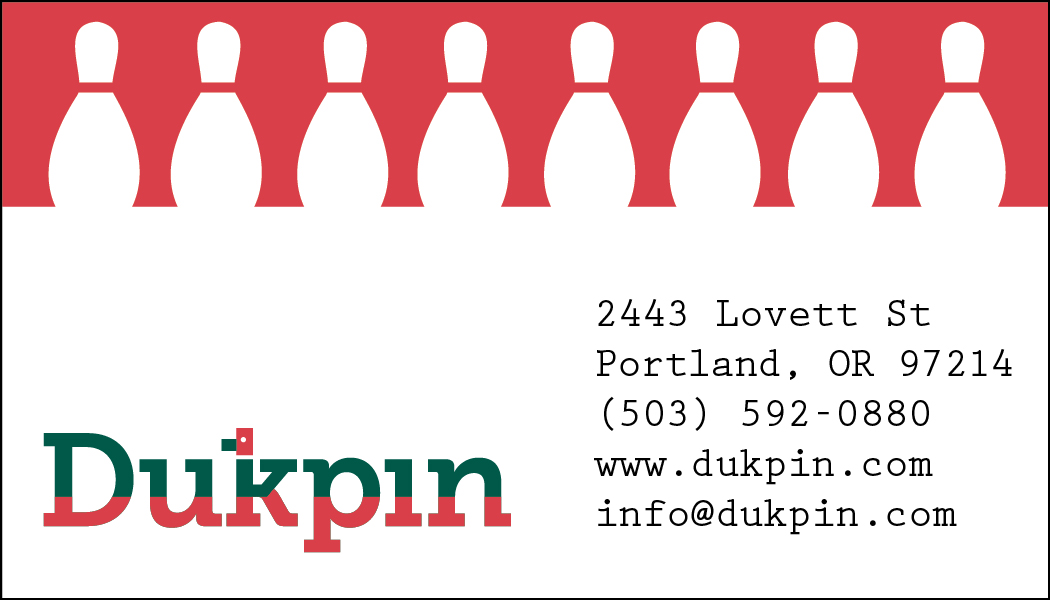
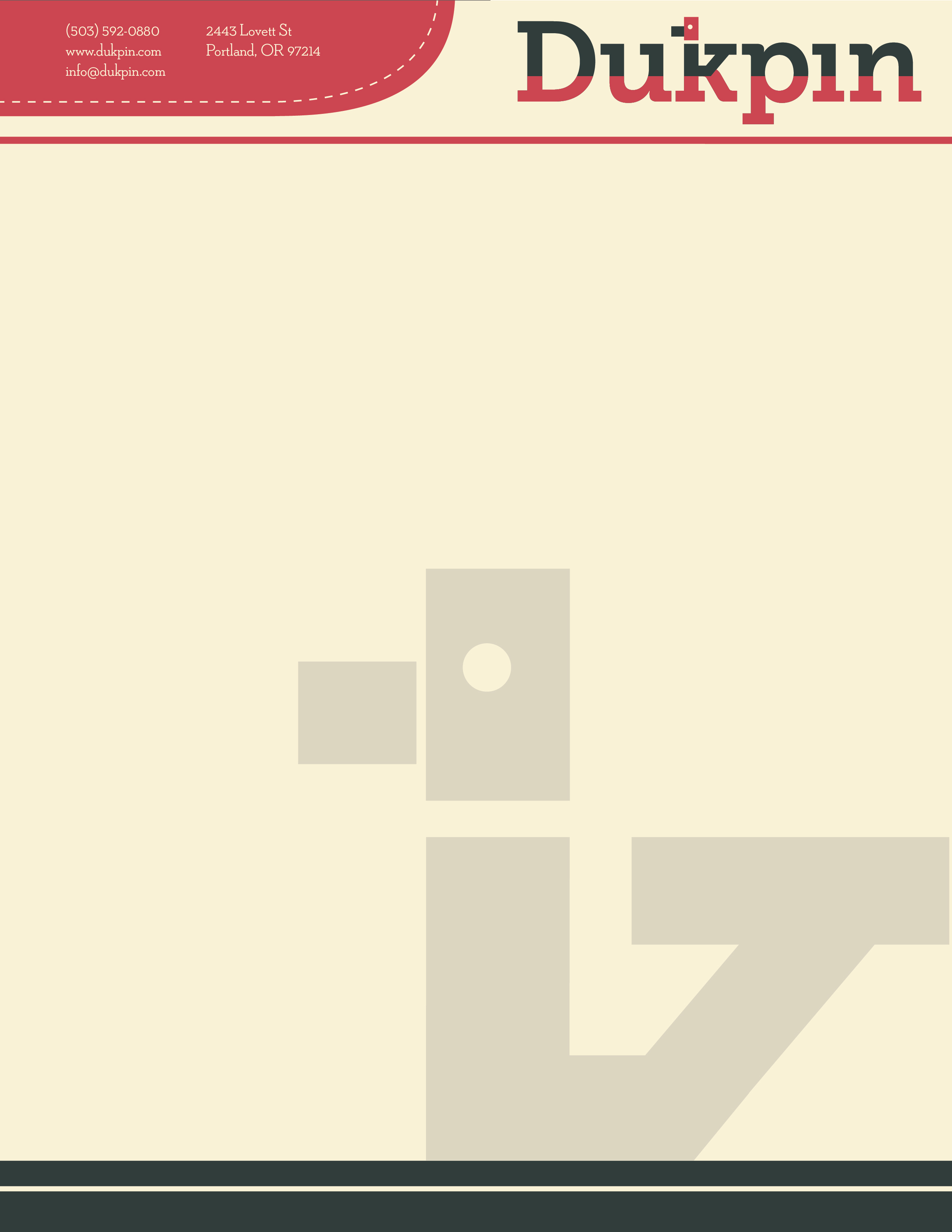
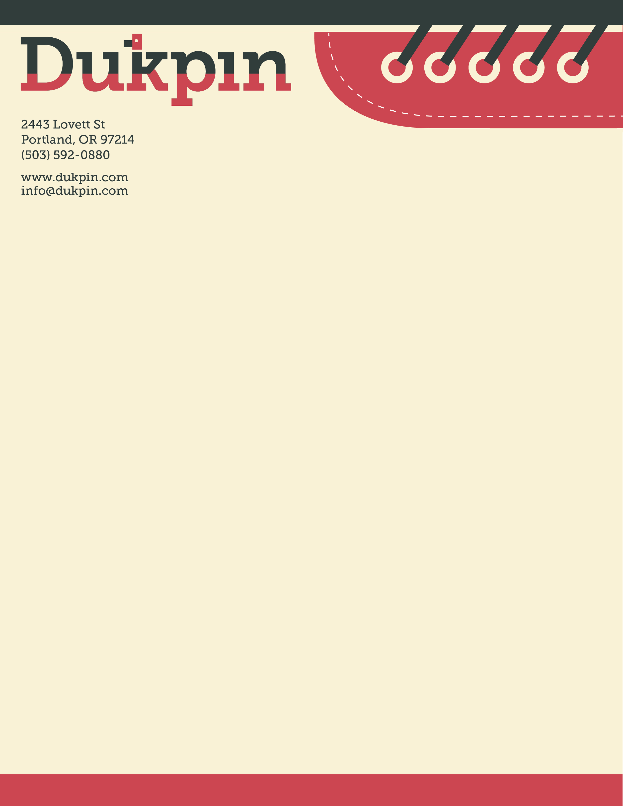
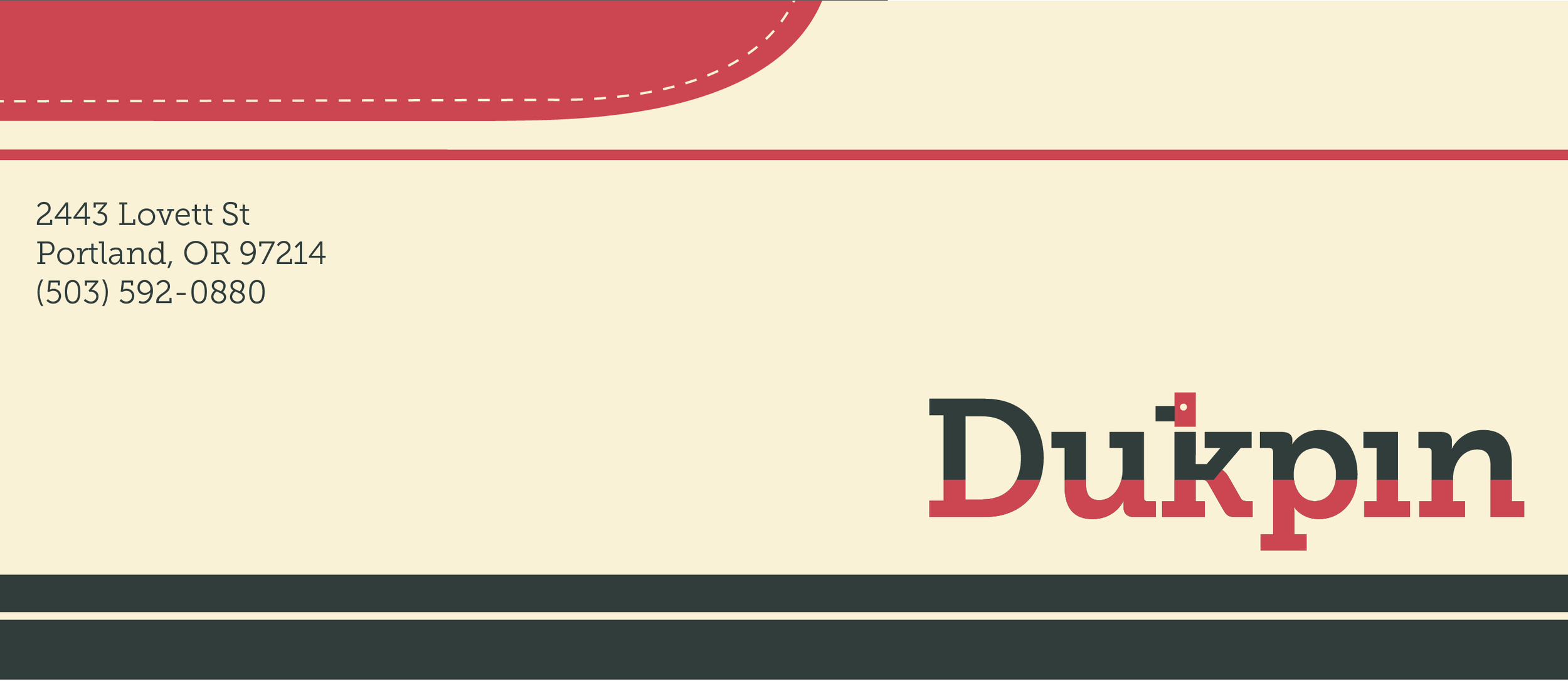
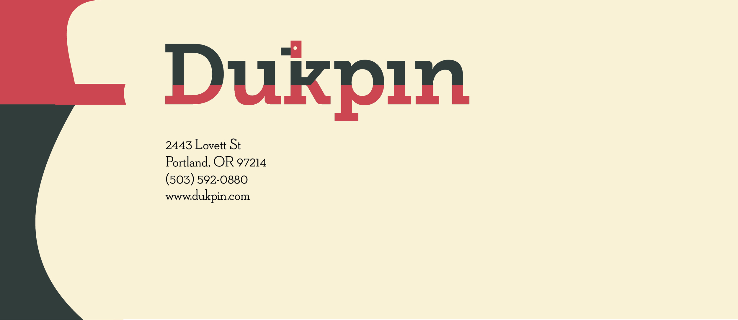
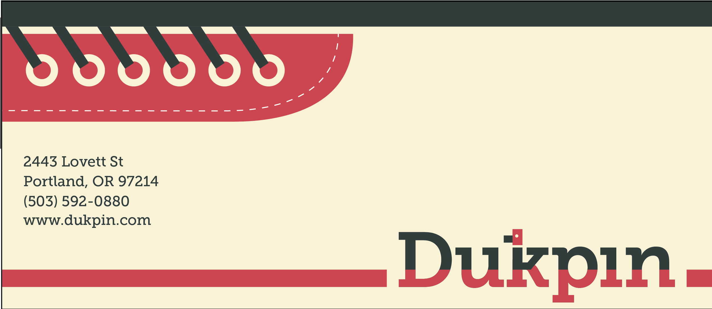
DUKPIN LOGO AND STATIONARY DESIGN
8.5x11" sheet, 2x3.5" business card, 9.5x4.125" envelope
Adobe Illustrator, InDesign (2015)
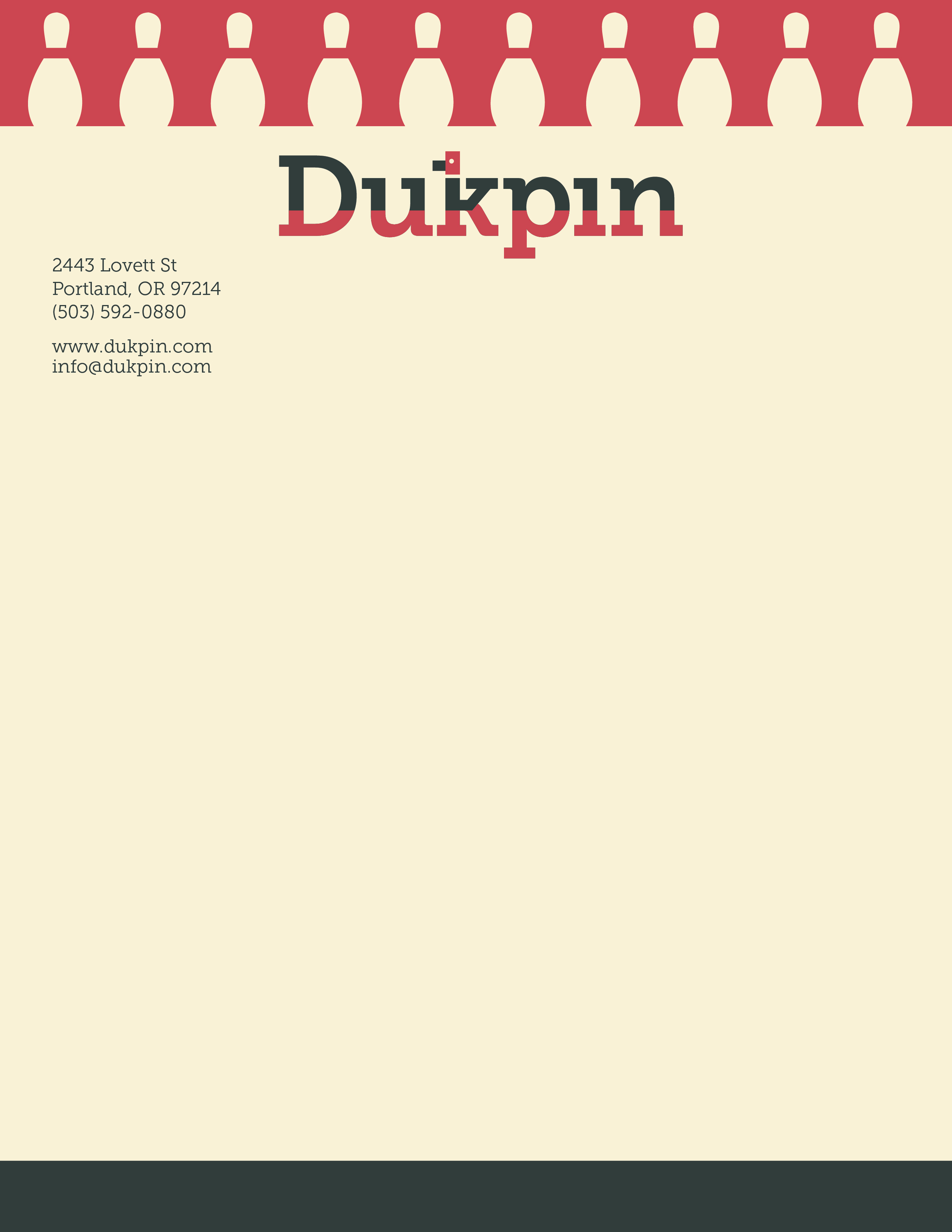
For this project, I created a brand called Dukpin, a bowling alley targeted at a "hipster" audience seeking a vintage bowling experience. The integrated stationary design system incorporates a palette inspired by classic bowling shoes, as well as a logo design that feels vintage and friendly. The typeface used is Museo Slab.
Process
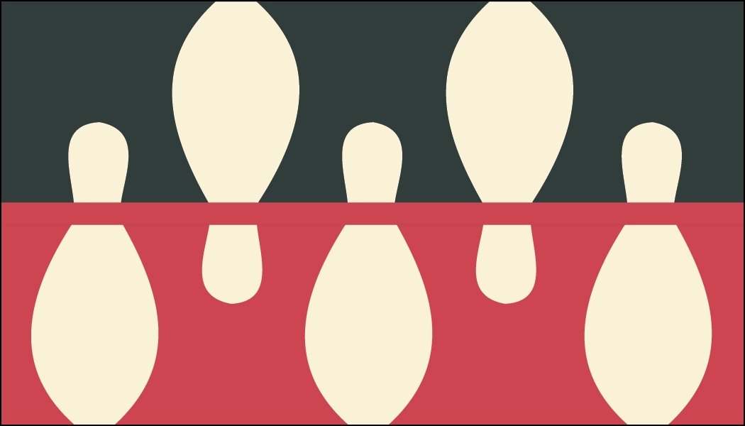
For this project, I had to create a brand for a hipster bowling alley. I looked to a variety of sources for visual inspiration, such as vintage bowling alleys and coffee shops. I also researched little known kinds of bowling, and discovered variations of bowling such as candlepin bowling and duckpin bowling. From there, I brainstormed a variety of names and logos with the aim of incorporating bowling symbols and a vintage feel.

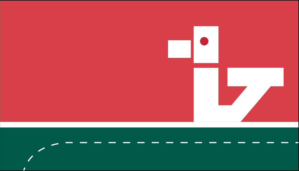
Once I found an idea I liked (using the slab serif font and turning the serifs of one of the letter into a duck), I began to create digital variations of that logo in illustrator. Eventually I chose the typeface Museo Slab since it had an old-school feel but also felt friendly and inviting. The color palette came from classic bowling shoes.
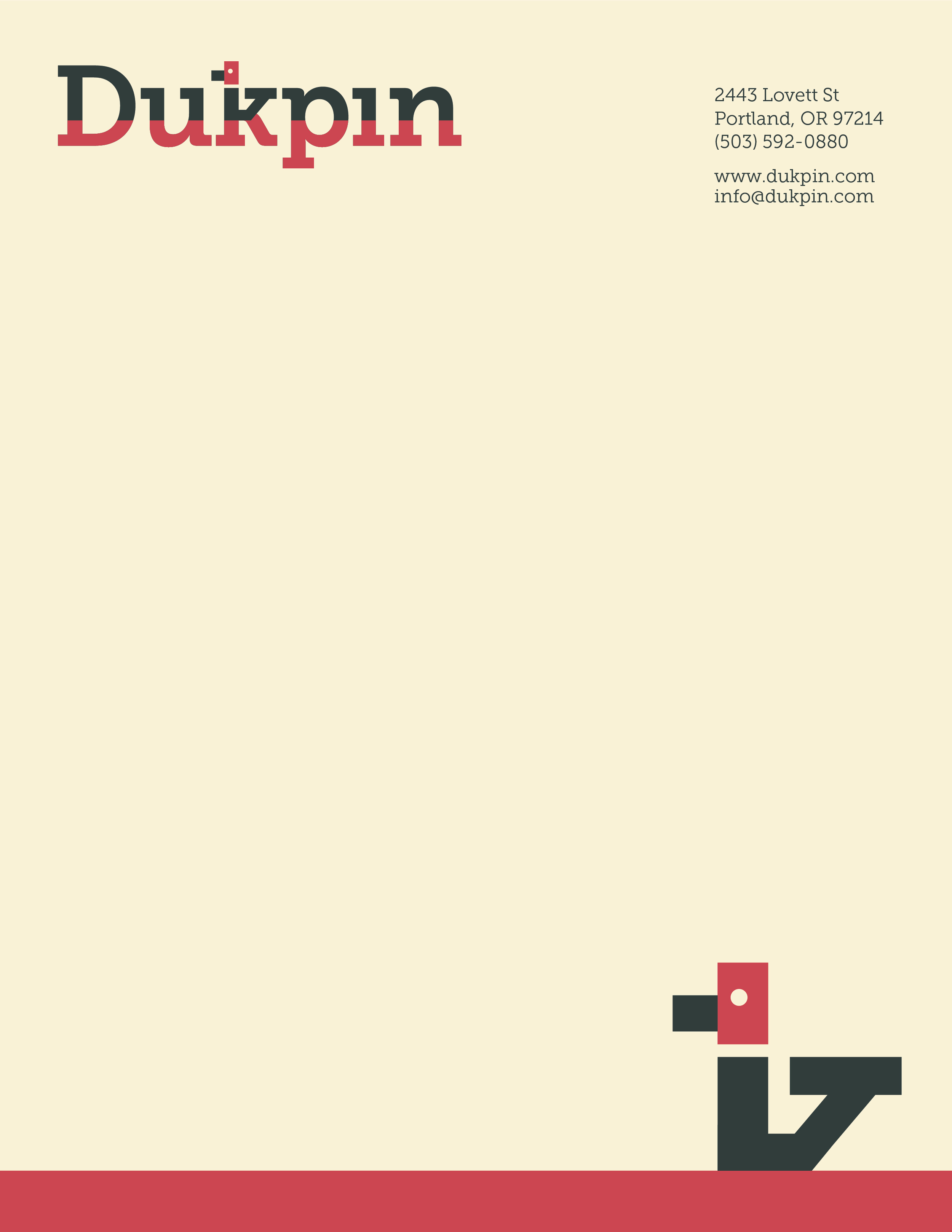
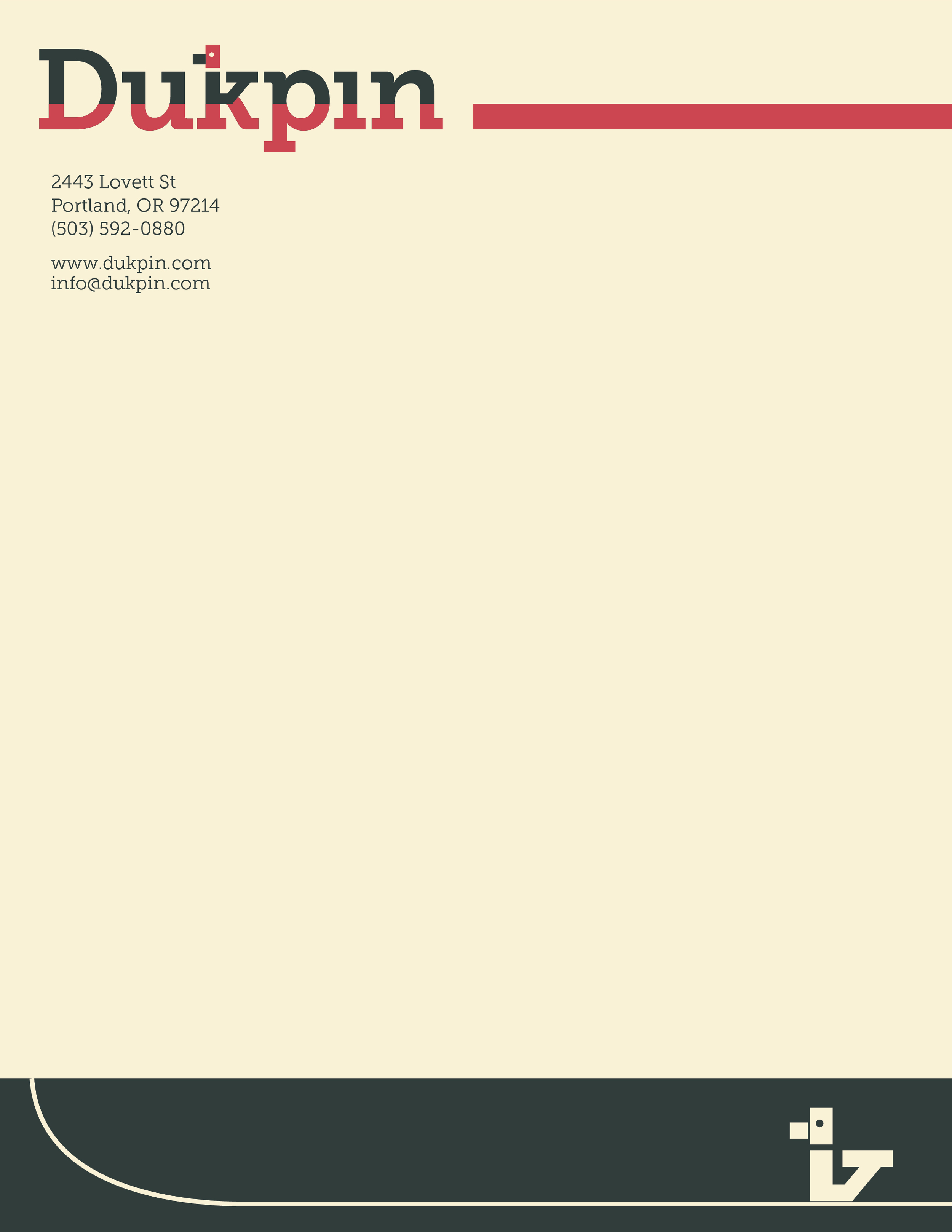
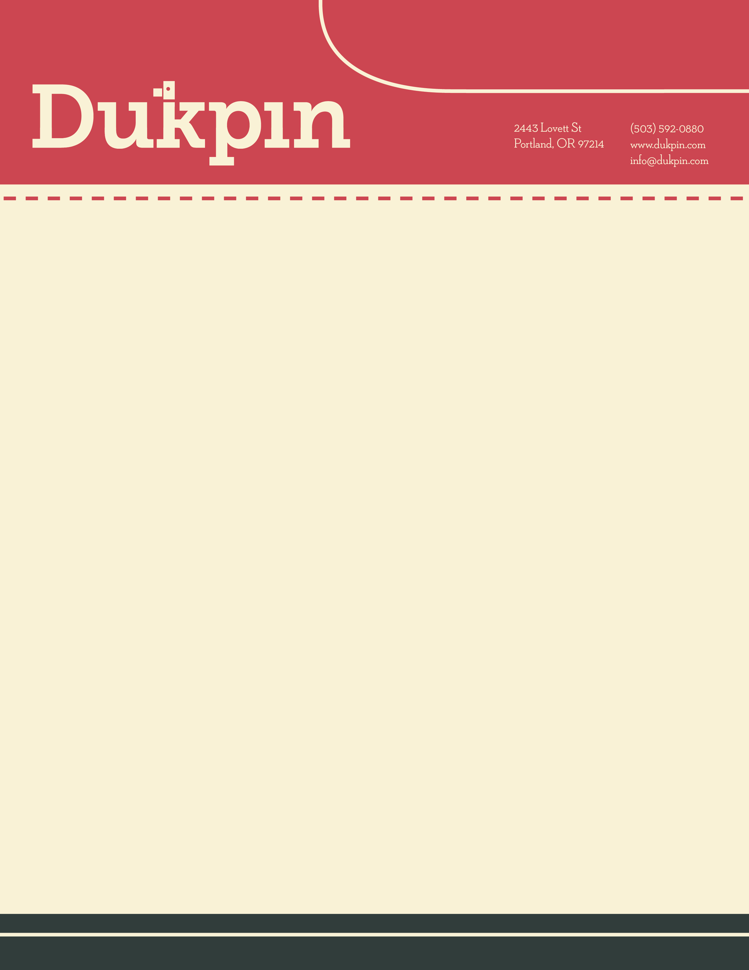
Once I finalized the logo, I began creating variations of the business card that expanded on elements of the logo. Part of the challenge was creating a visual identity that was not too obvious but also not confusing or unrelated. I also tried to consider how the visual motifs I used in the business card would work when placed in the context of the letterhead and envelope.