The Vignelli Canon
"The Vignelli Canon" by Massimo Vignelli, designed by Zeke Saucedo
Adobe Photoship, InDesign (2016)
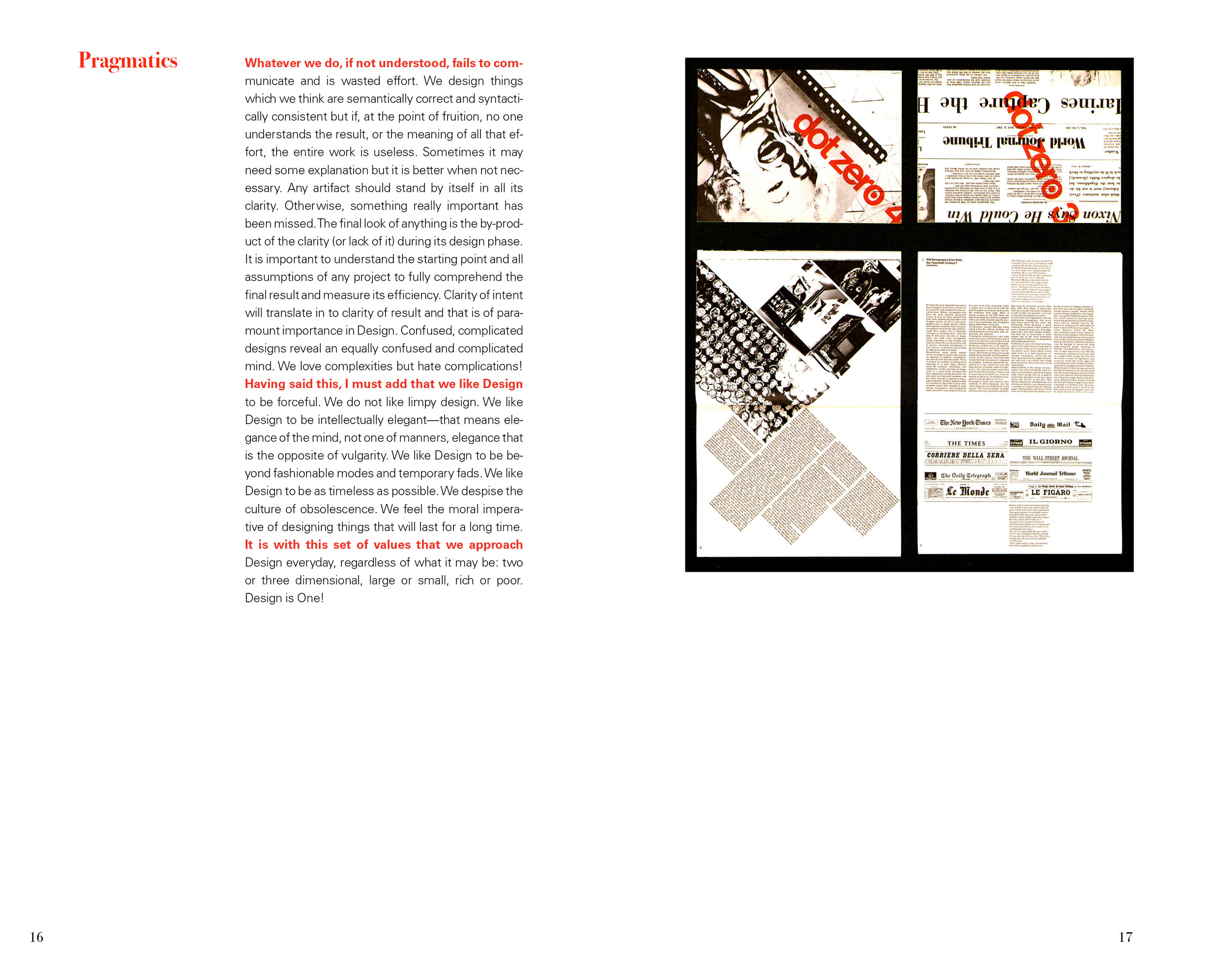
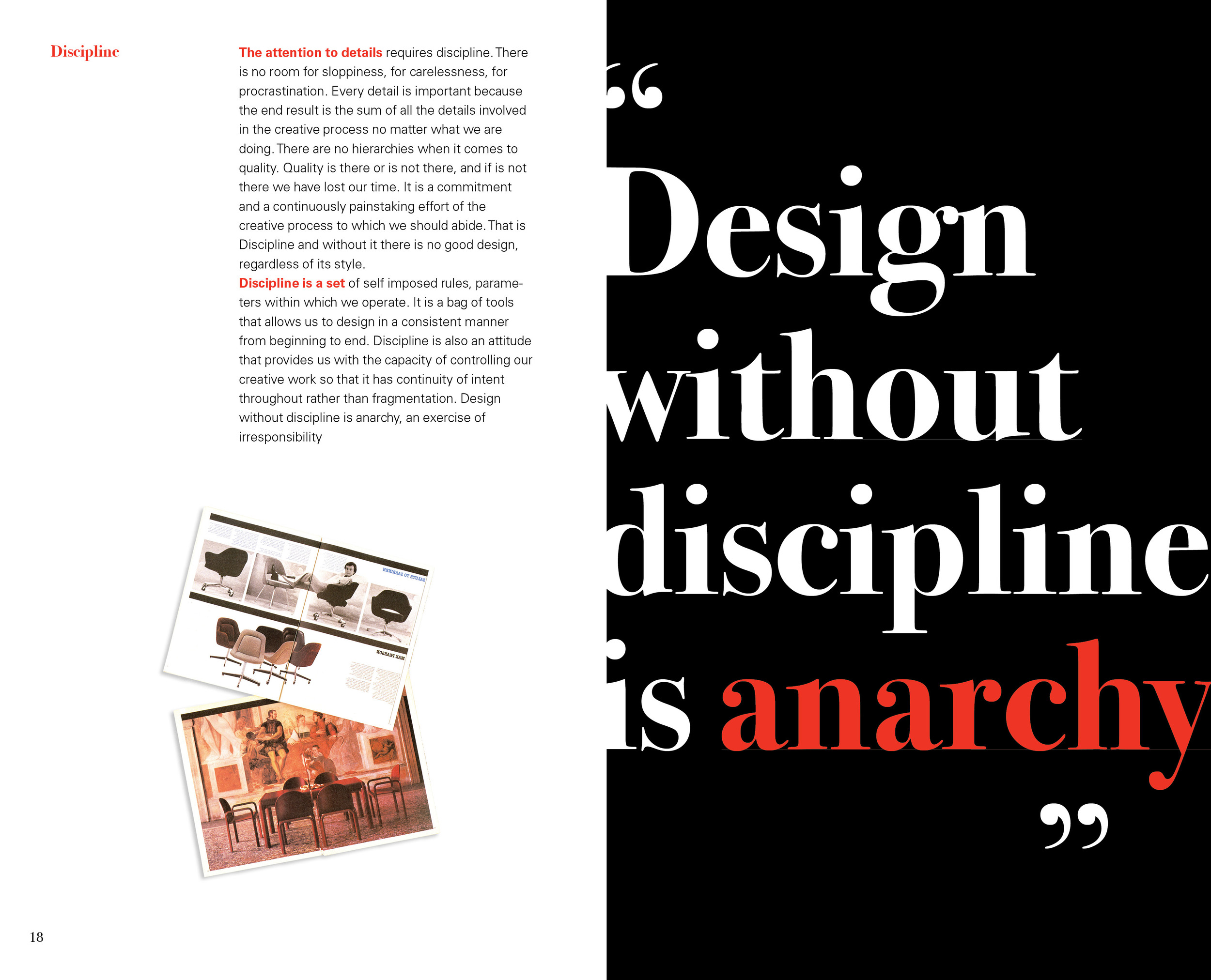
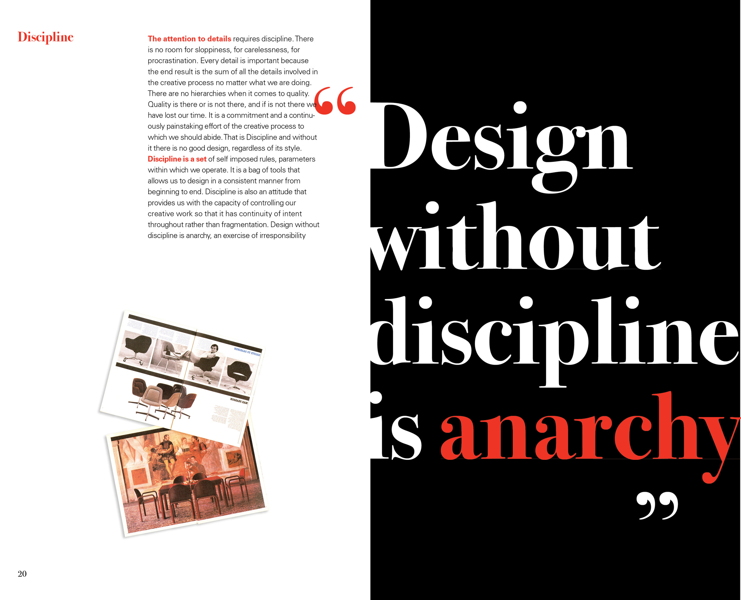
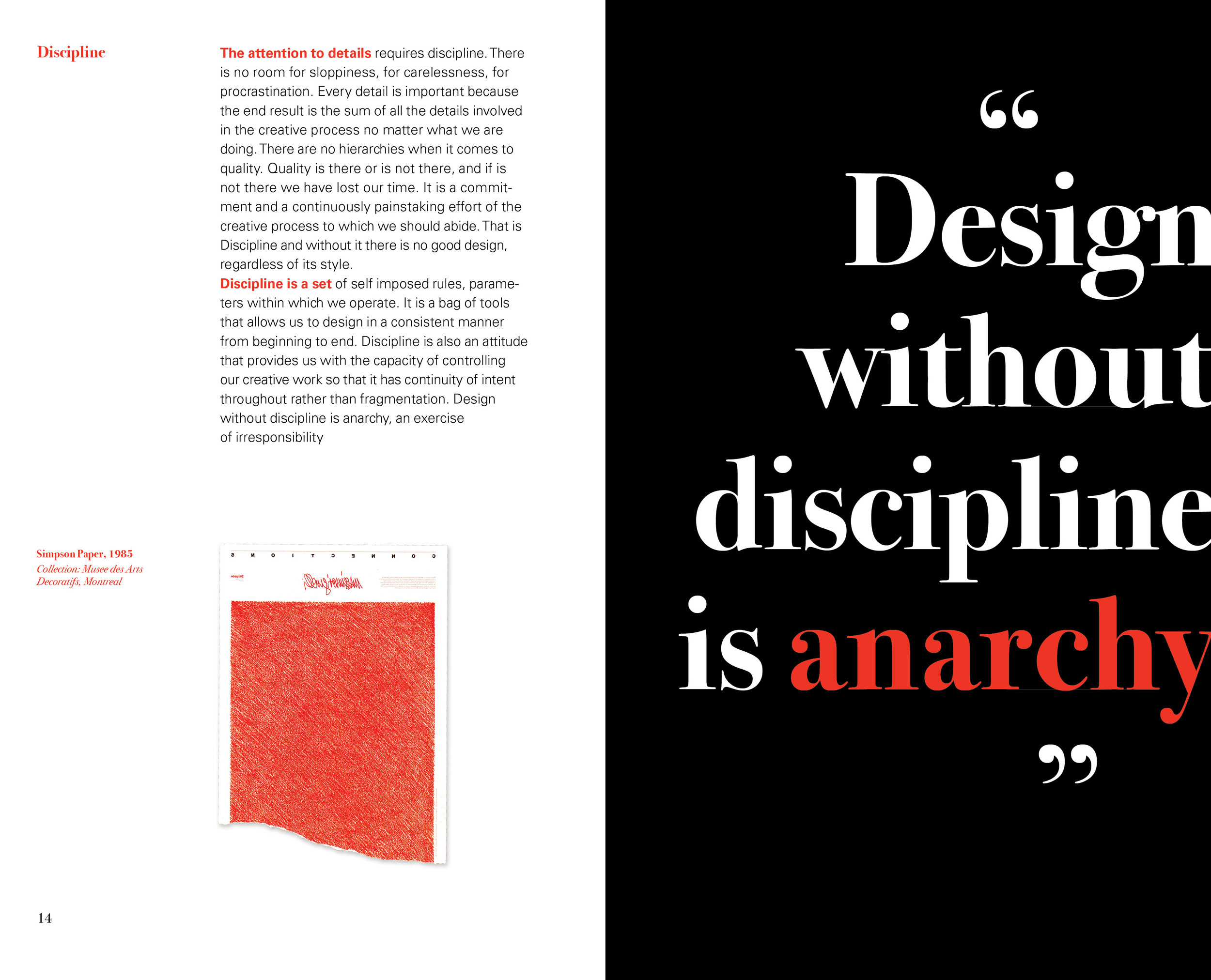
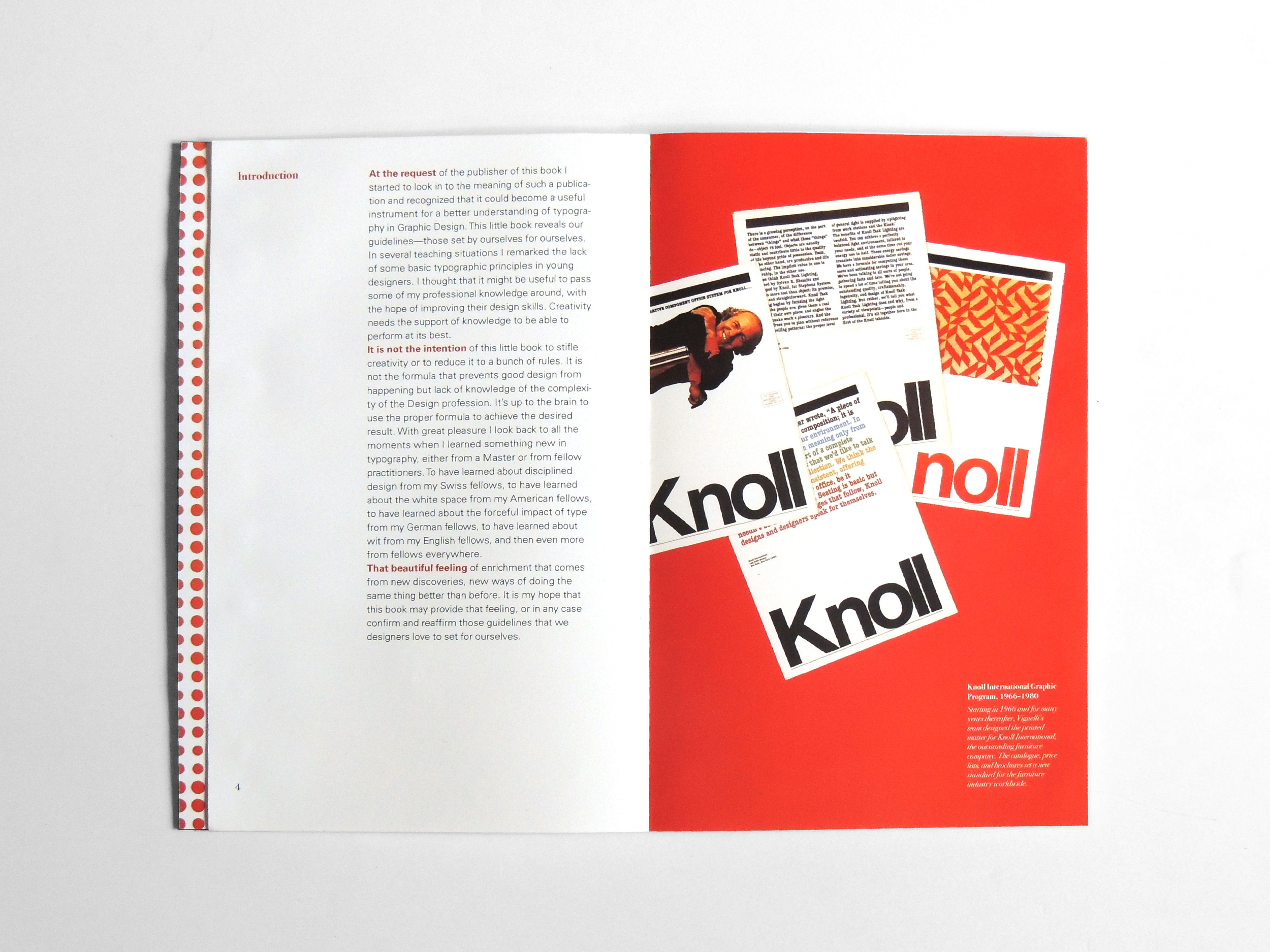
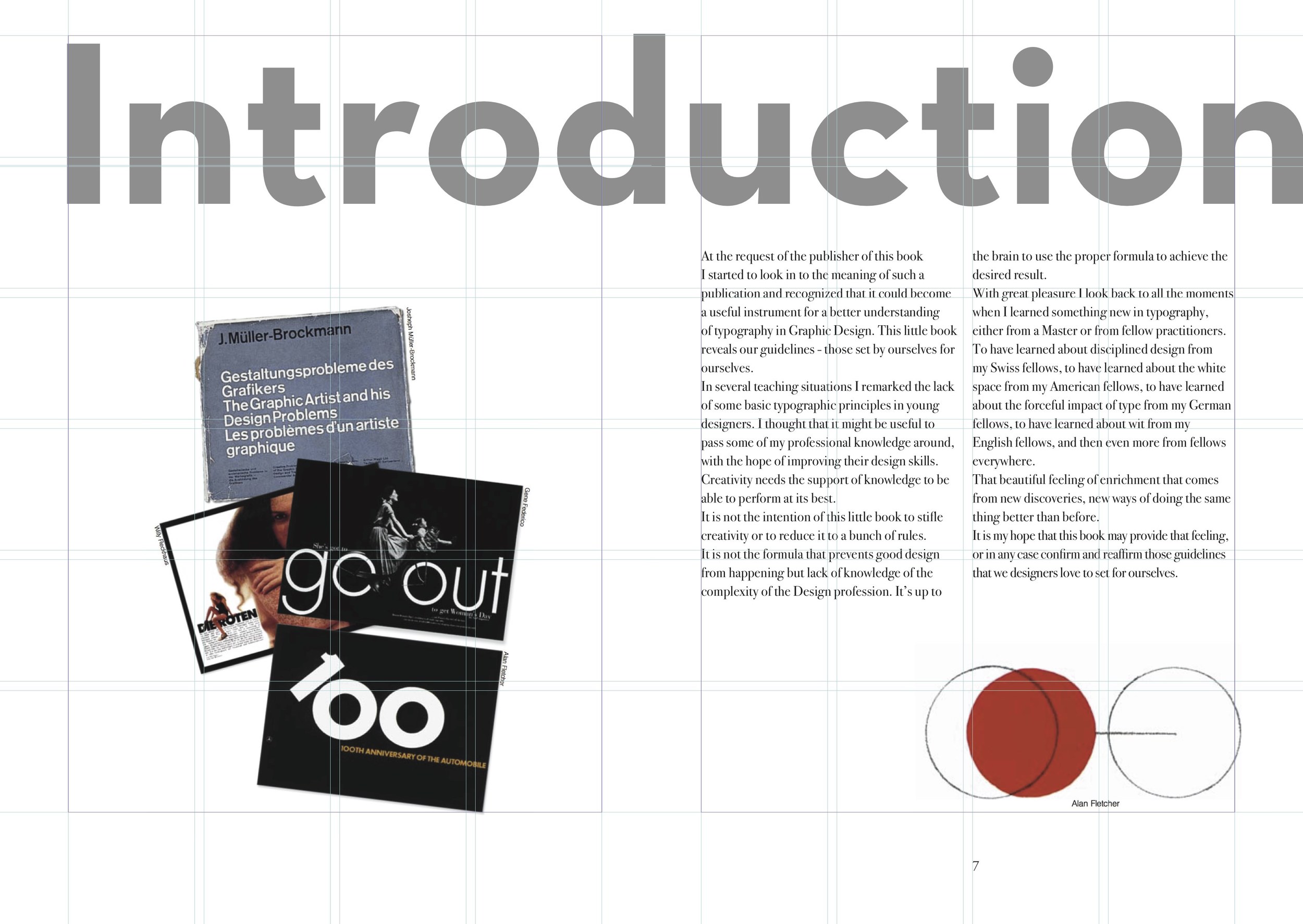
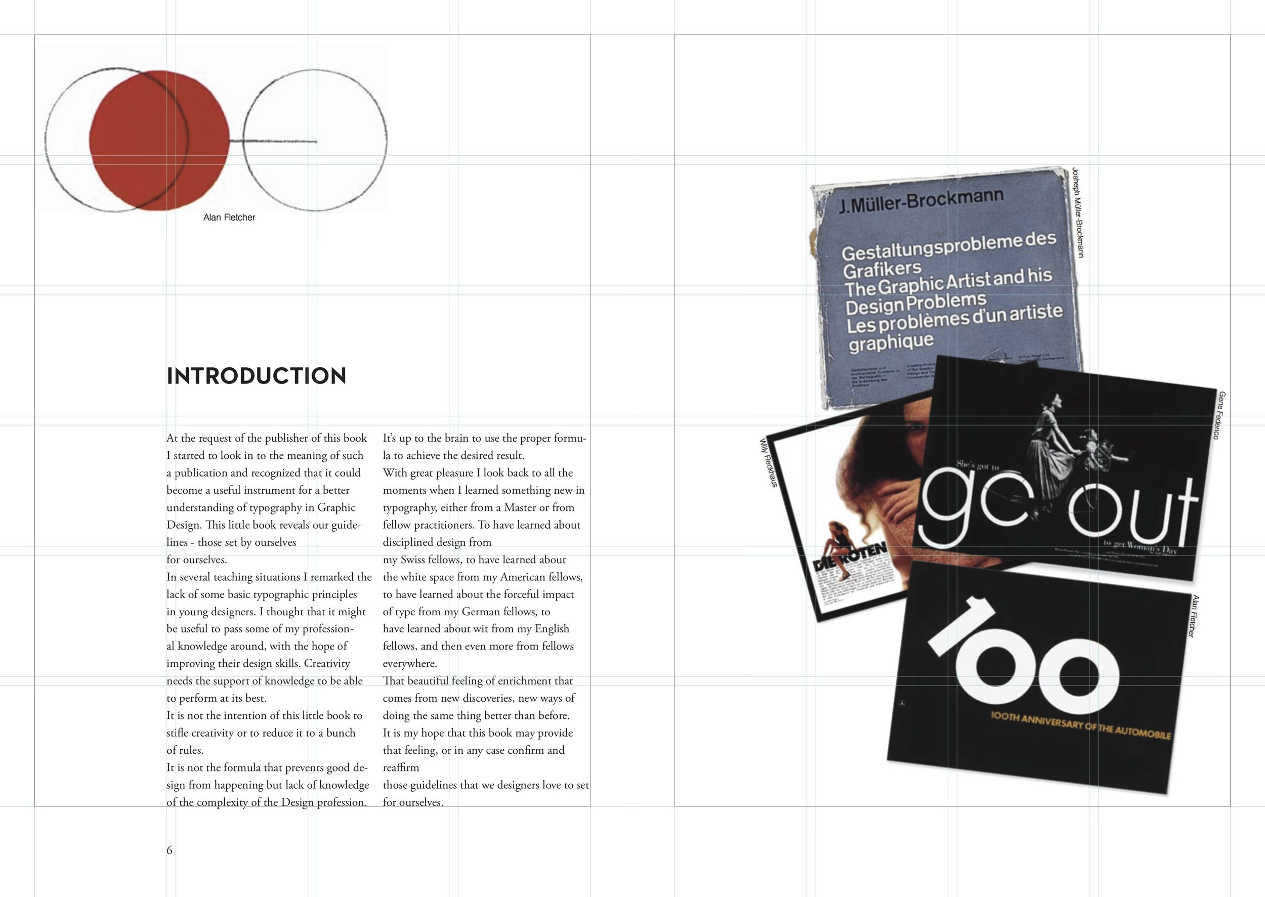
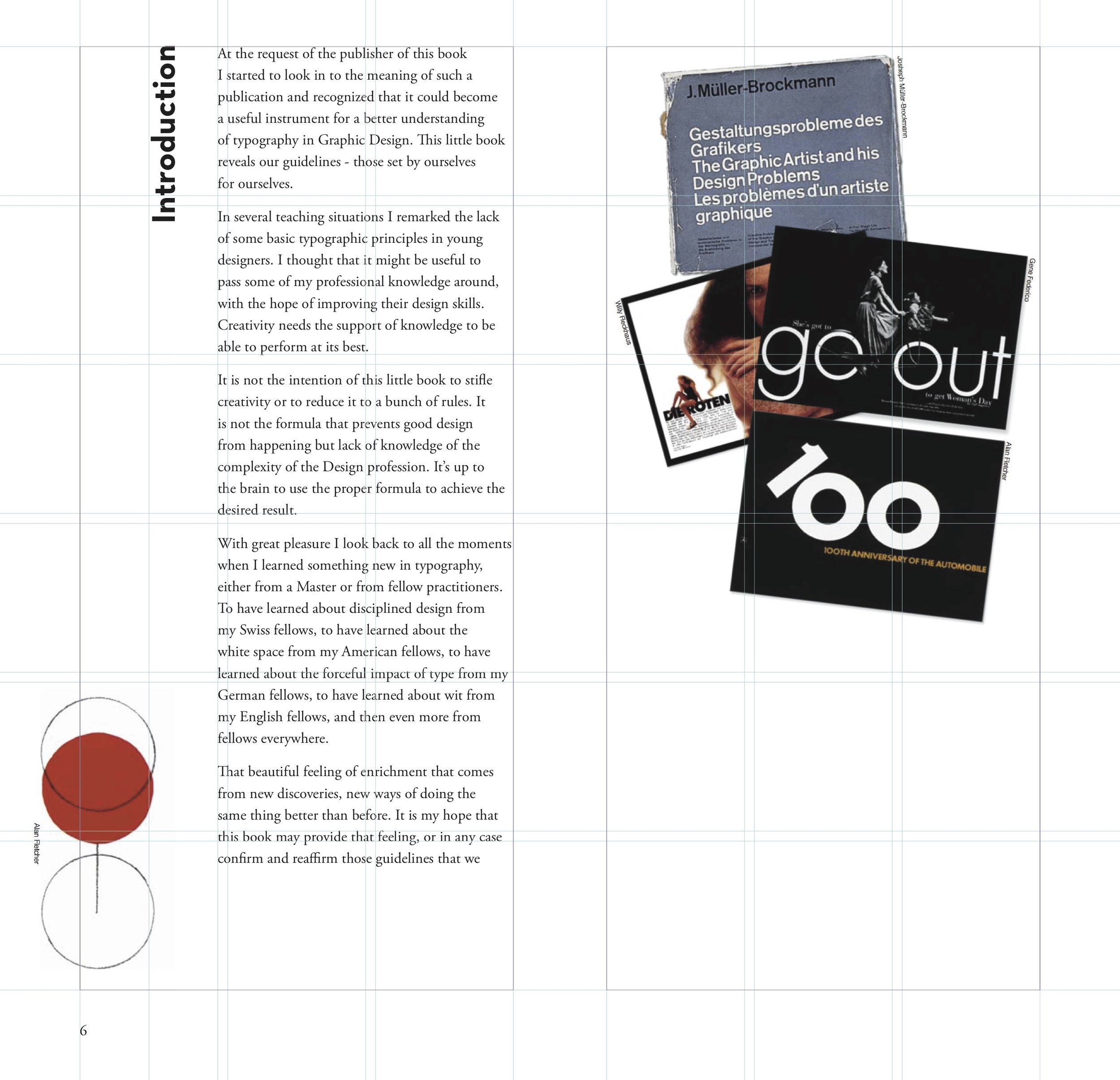
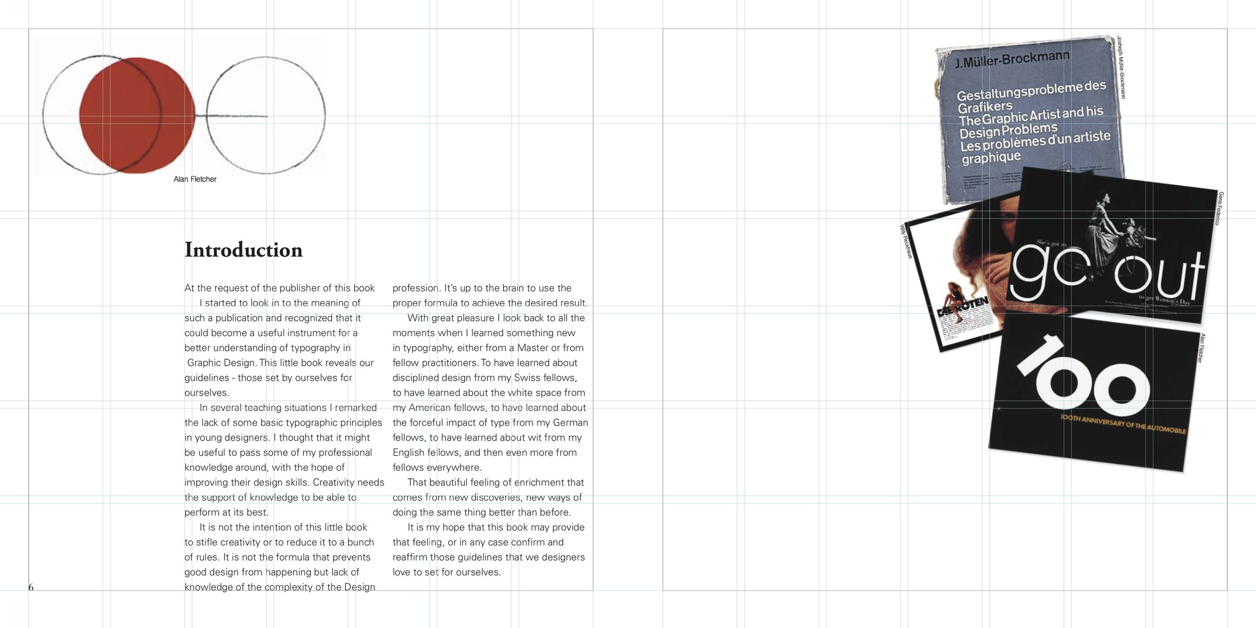
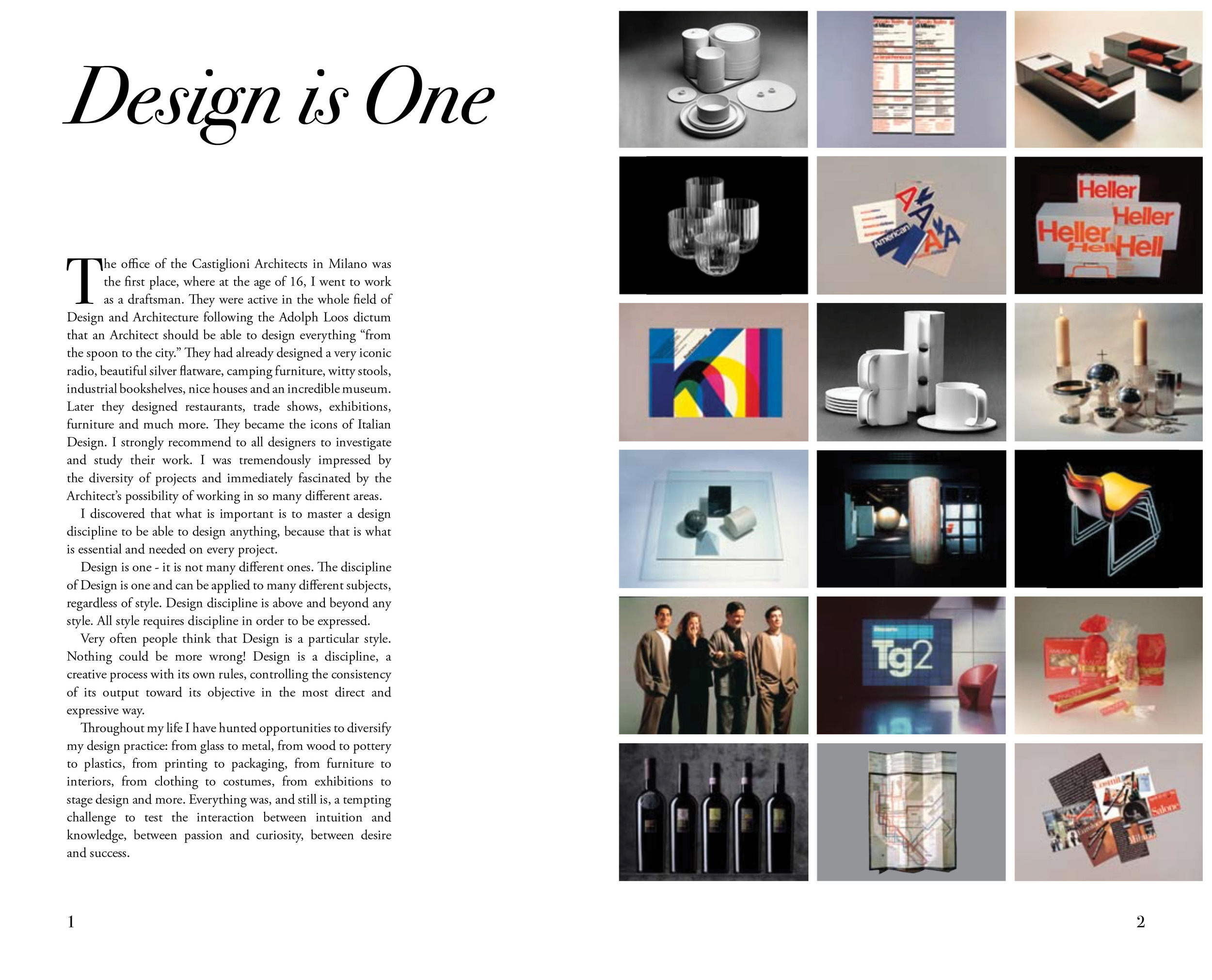
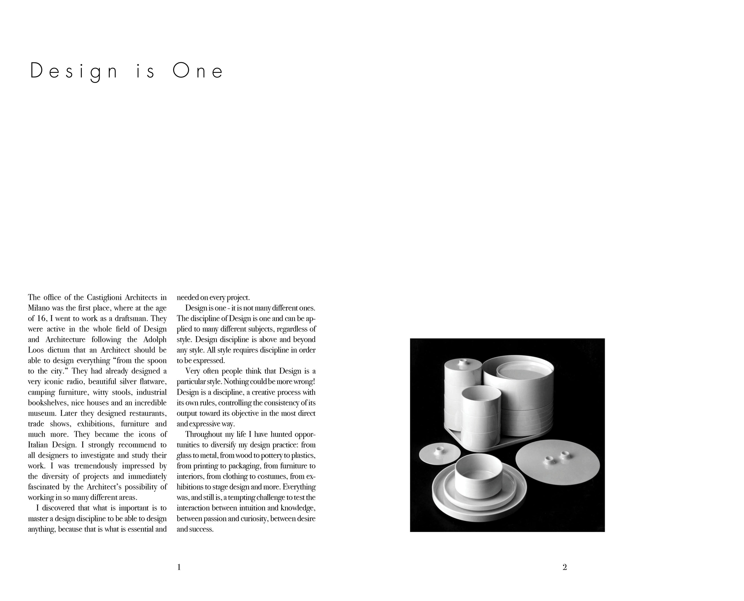
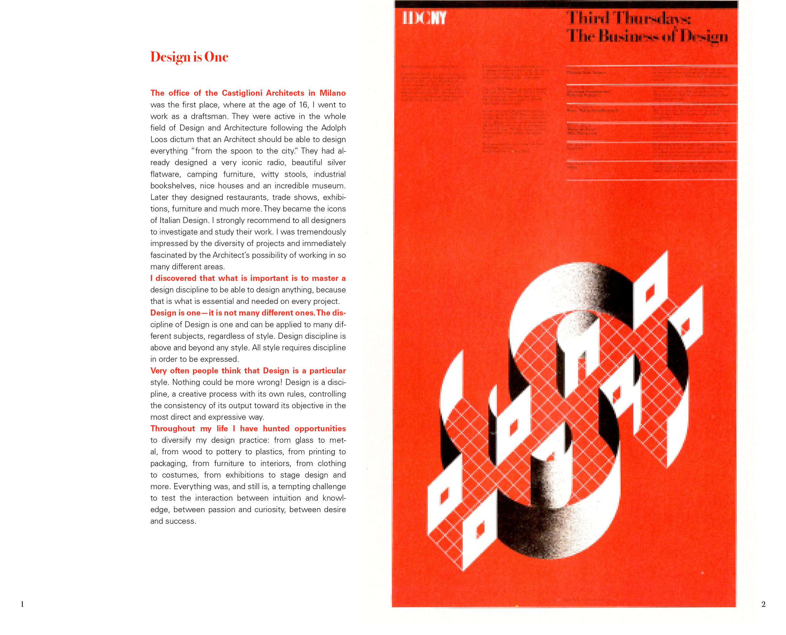
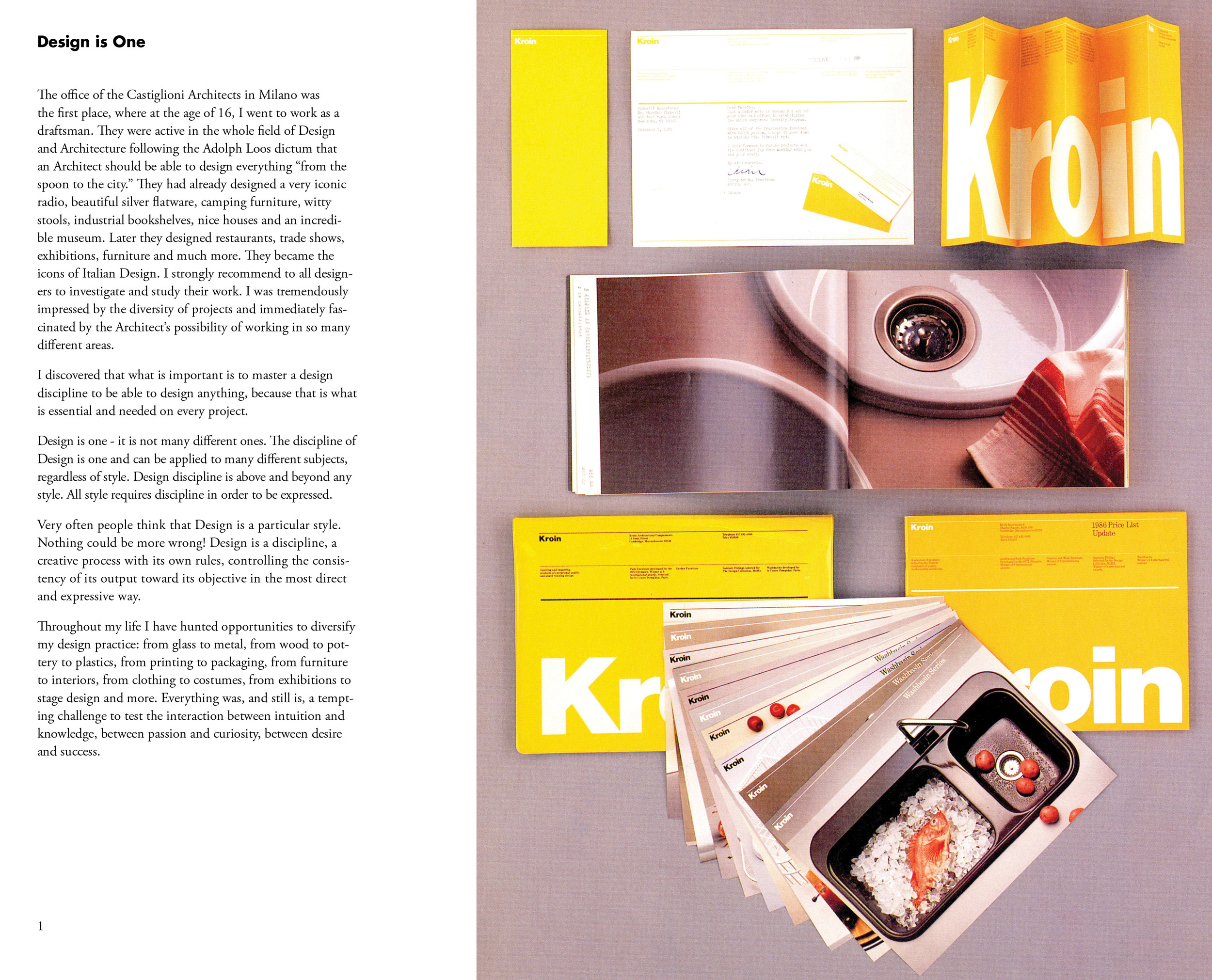
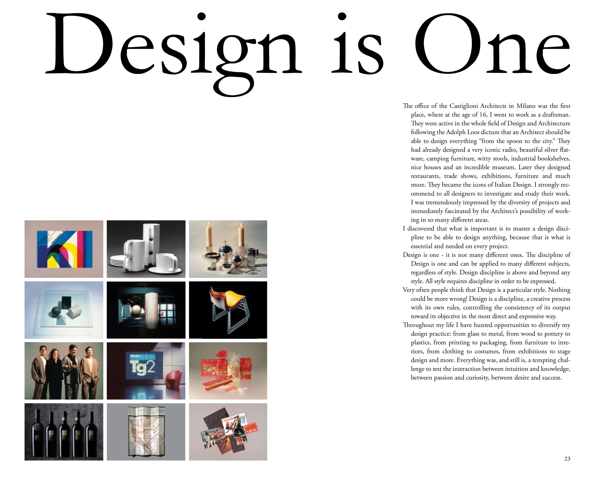
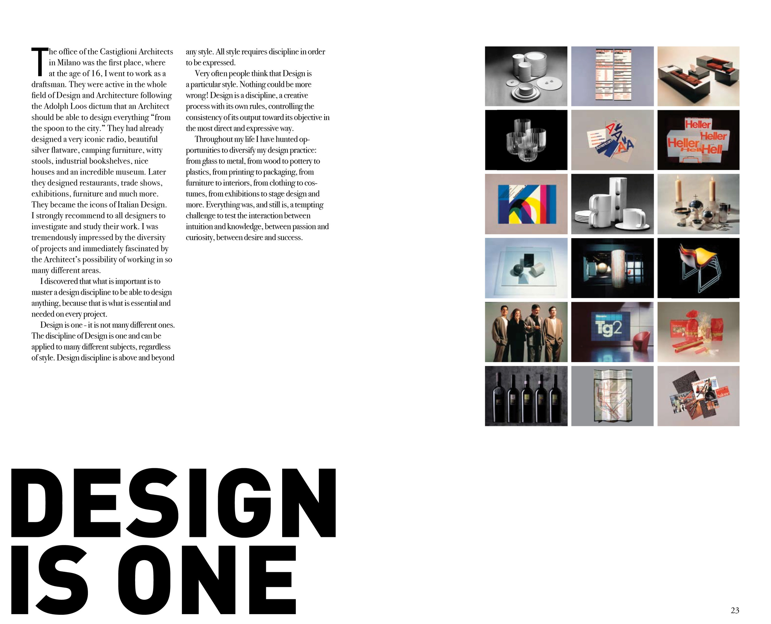
For this project, I redesigned "The Vignelli Canon", an ebook originally released by Massimo Vignelli in 2009. In the text, Vignelli outlines the principles that he views as being most crucial to design, and he describes his approach to the design process. In creating this physical version of Vignelli's digital book, I worked to incorporate several of Vignelli's principles, such as the use of the golden ratio for the proportions of the book and the use of the elegant, modern typefaces Bodoni and Univers. However, I also broke away from Vignelli's system in some instances in order to reflect my own personality and vision. Instead of using a rigid modular grid, for example, I aligned text using the baseline grid. I made the first phrase of each paragraph red and bolded in order to clearly indicate the start of a new paragraph without having to break up the text. Additionally, I used the threshold and gradient map tools in Photoshop to recolor some images in order to ensure that they fit the visual system of the book.


PROCESS
I began the process of redesigning the Vignelli Canon by reading through the text and considering the design of the original (which can be found here: http://www.vignelli.com/canon.pdf) Next, I dumped the text onto blank pages and created preliminary drafts to find the best page size, page proportions, and font size. I experimented with different modular grids and ways of approaching hierarchy.
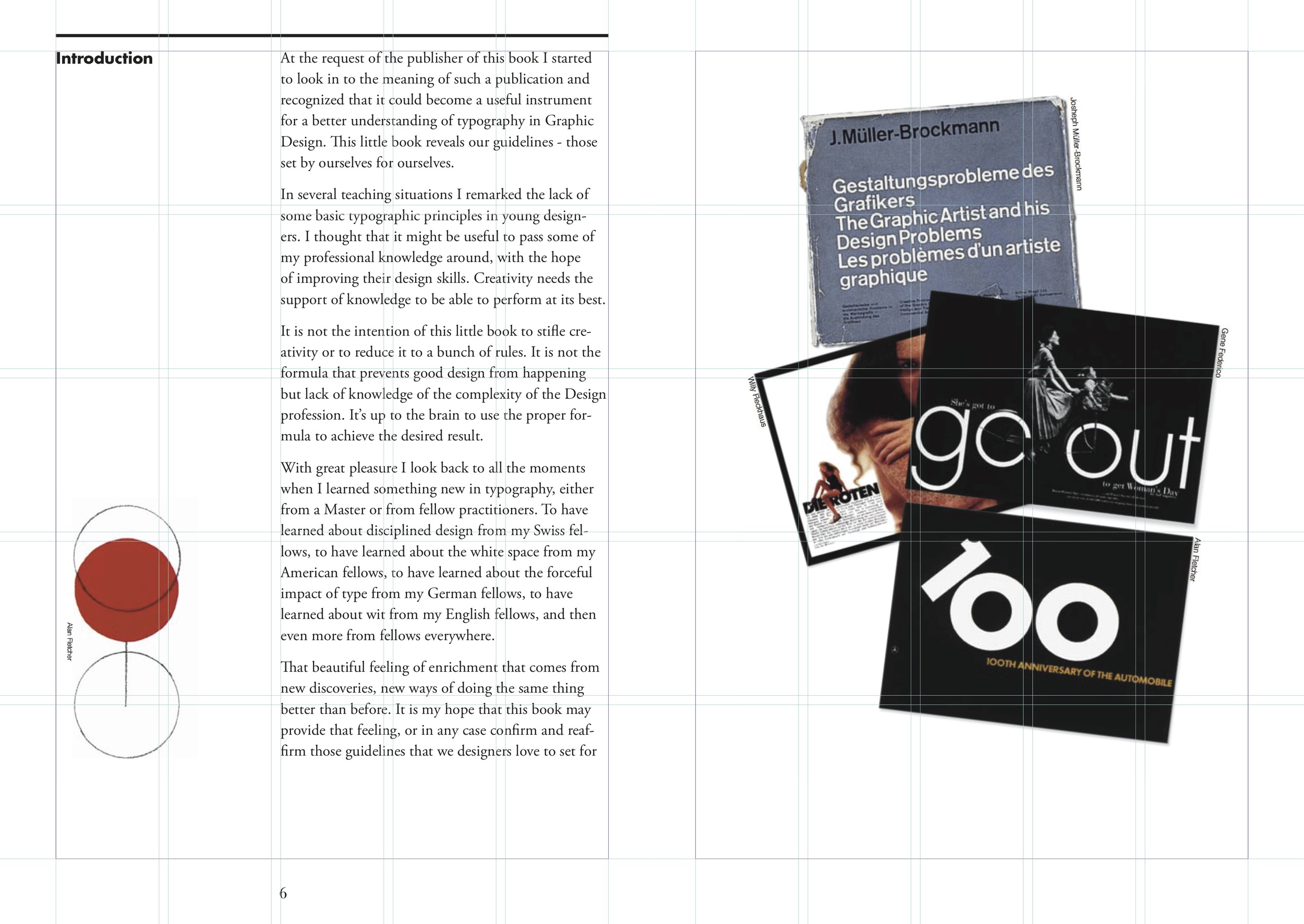
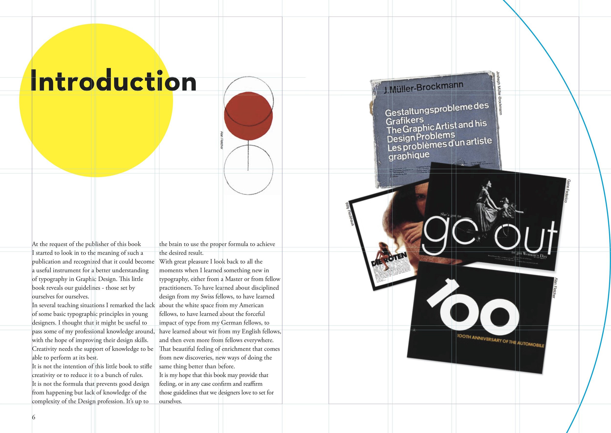
I decided to use a fairly small page size for my book, since there was not much text on each page. I also decided to use the proportion of the golden ratio, which Vignelli describes as the ideal proportion for a page. In terms of the grid and hierarchy, however, I was dissatisfied with the approaches I had come up with thus far, and decided to look to other books for inspiration. I went to the art and architecture library on campus and took pictures of books that I felt were well designed. I then created new drafts that included some of the strategies featured in the books I looked at.
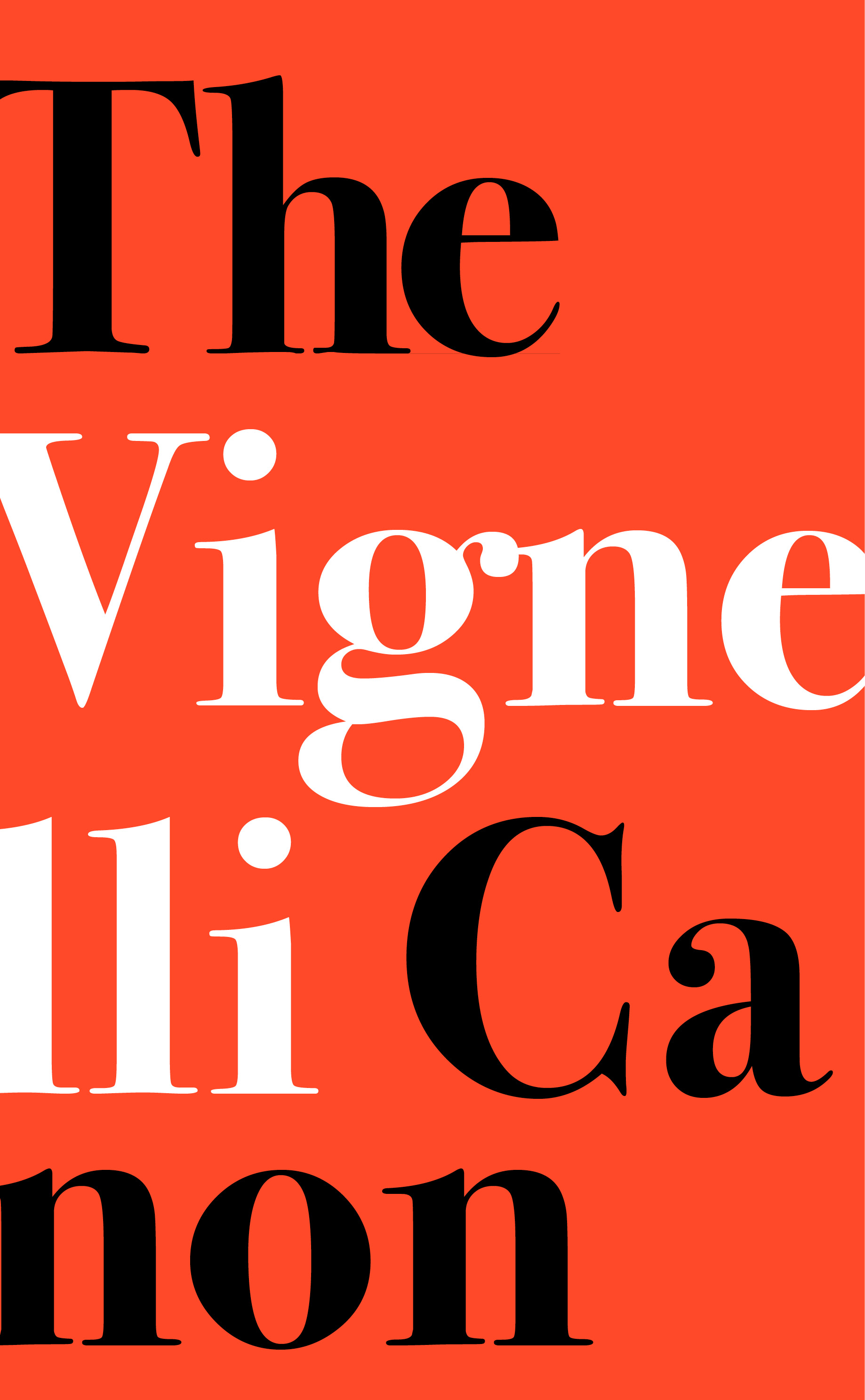
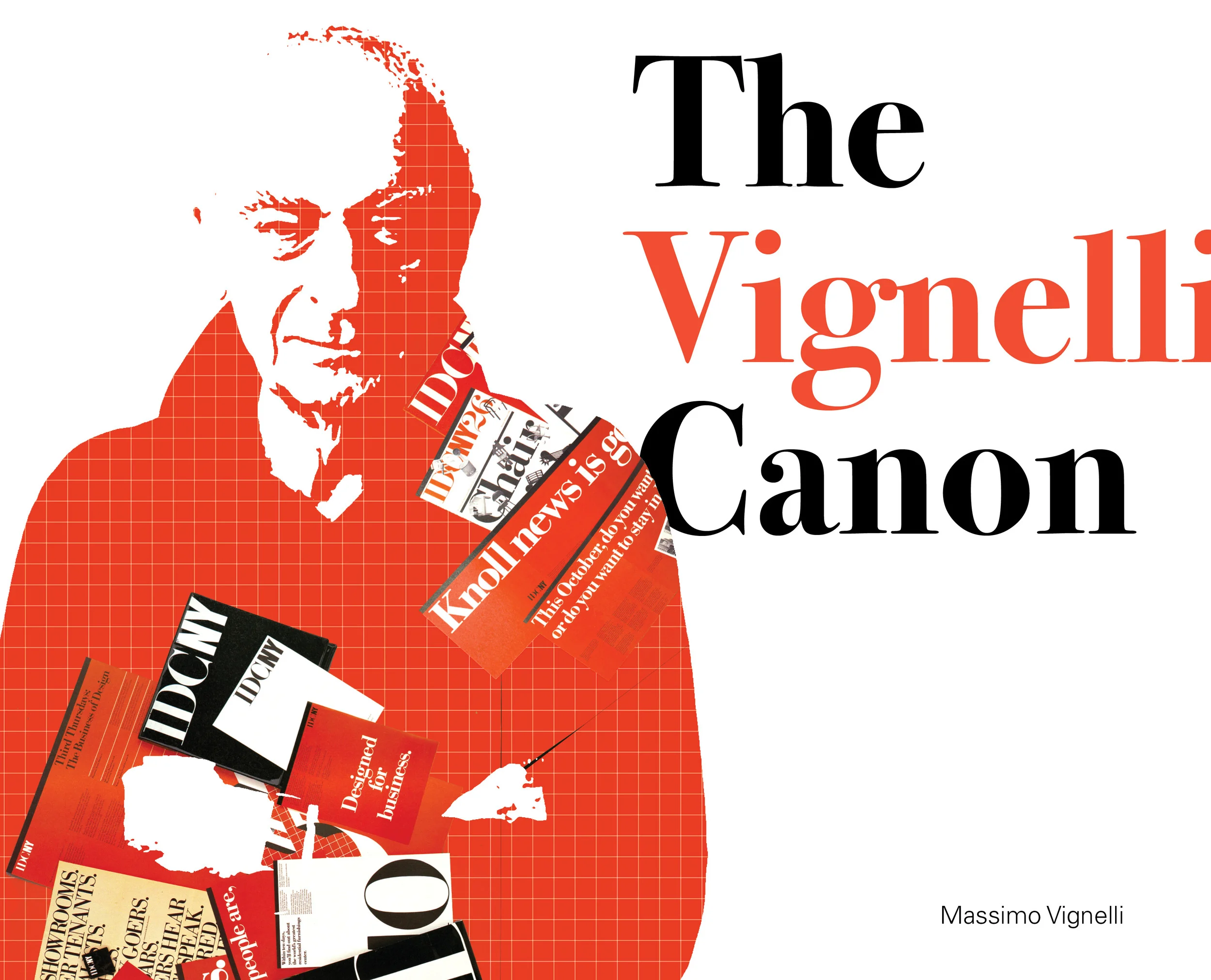
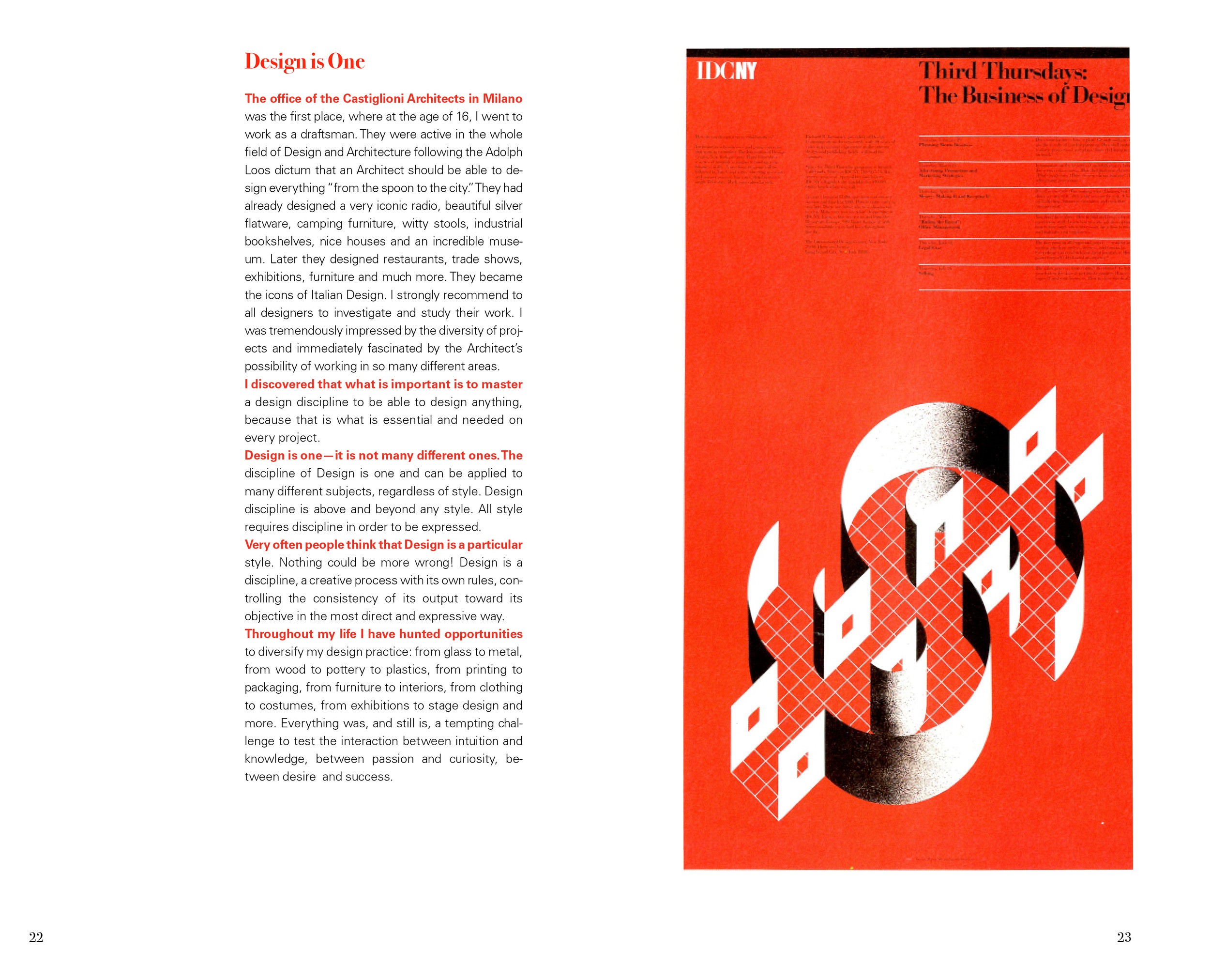
Additionally, I experimented with a variety of strategies for the design of the book's cover. I tried different fonts, colors, and arrangements that could fit with the page layouts I designed.
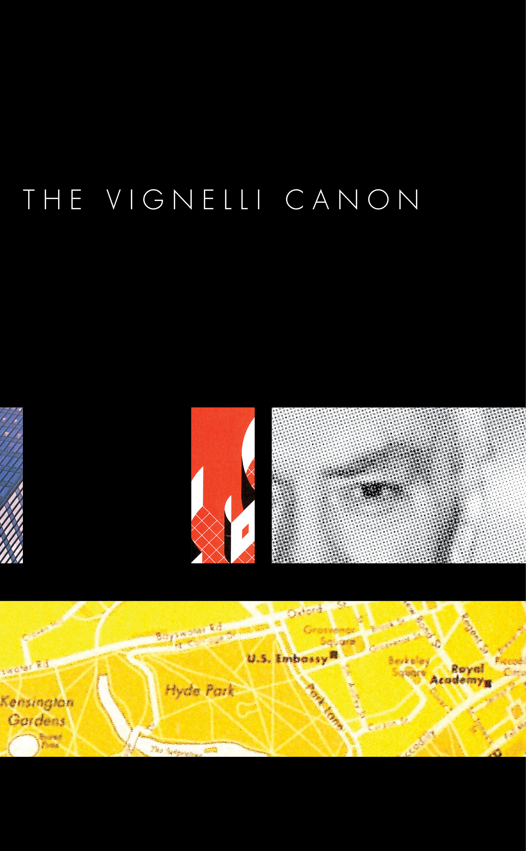
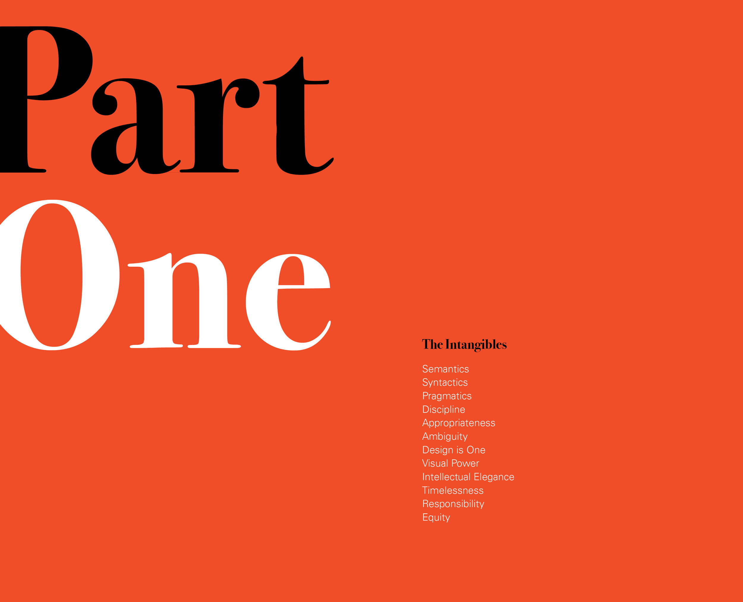
Eventually I chose to use the layout with the bold red text at the beginning of each paragraph. The idea for this strategy came in part from Vignelli's original design, which does not have any indents or line breaks to demarcate the beginning of a paragraph. This allows the text to go uninterrupted along the left edge. I wanted to recreate this effect without losing readability. Making the first line of each paragraph red seemed to accomplish this task, though I eventually chose to make only a short phrase red (instead of the whole line) so that the red text did not feel too separate from the rest of the paragraph. I also bolded the red text in order to counterbalance the fact that colored text naturally feels lighter than black text. Univers thus seemed like the best typeface for my design since the variety of weights would allow me to change weights mid-sentence without creating too much of a disturbance. In my page and cover designs, I chose to use images that heavily featured red or black to compliment the color of the text.