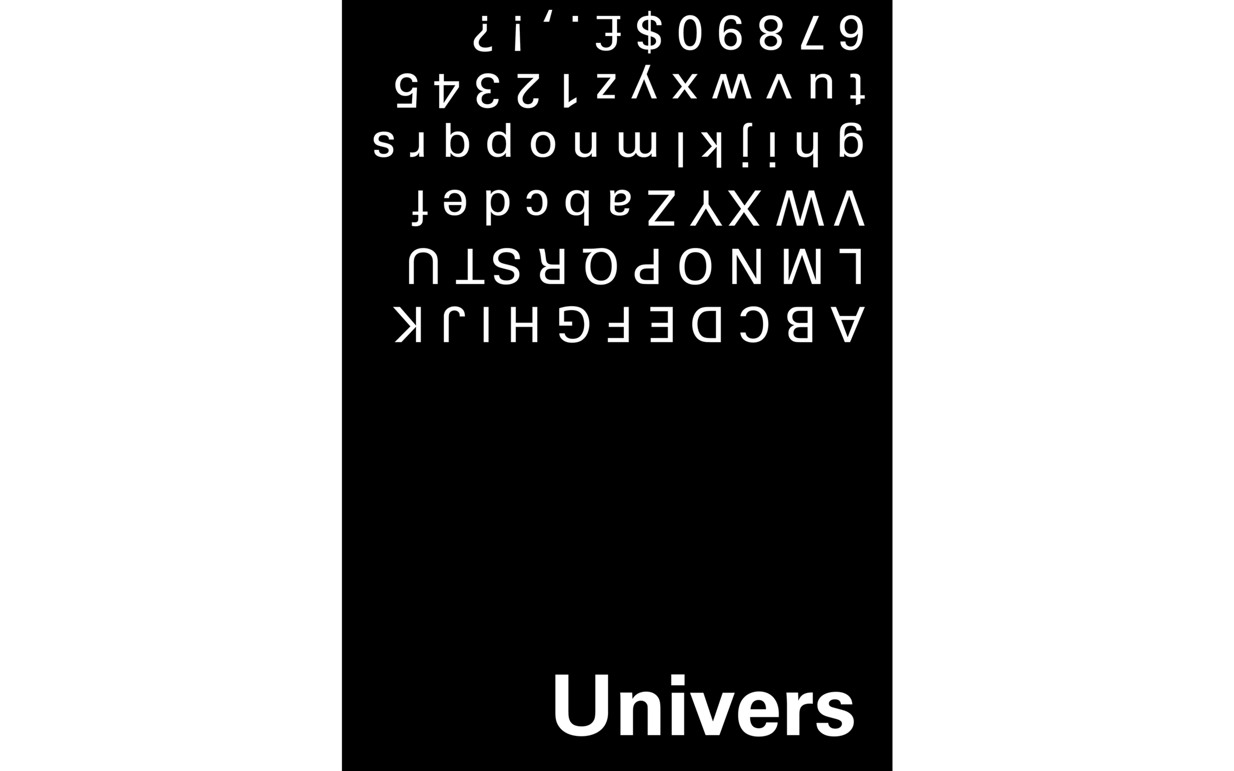
UNIVERS
Adobe Illustrator, InDesign (2015)
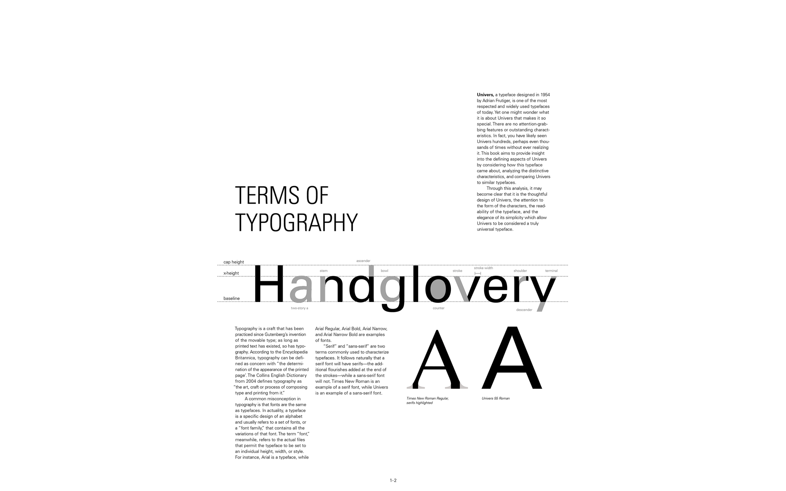
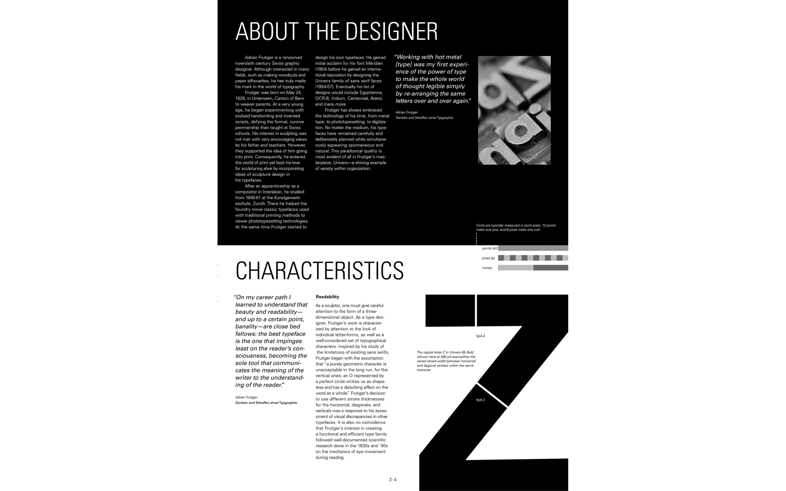
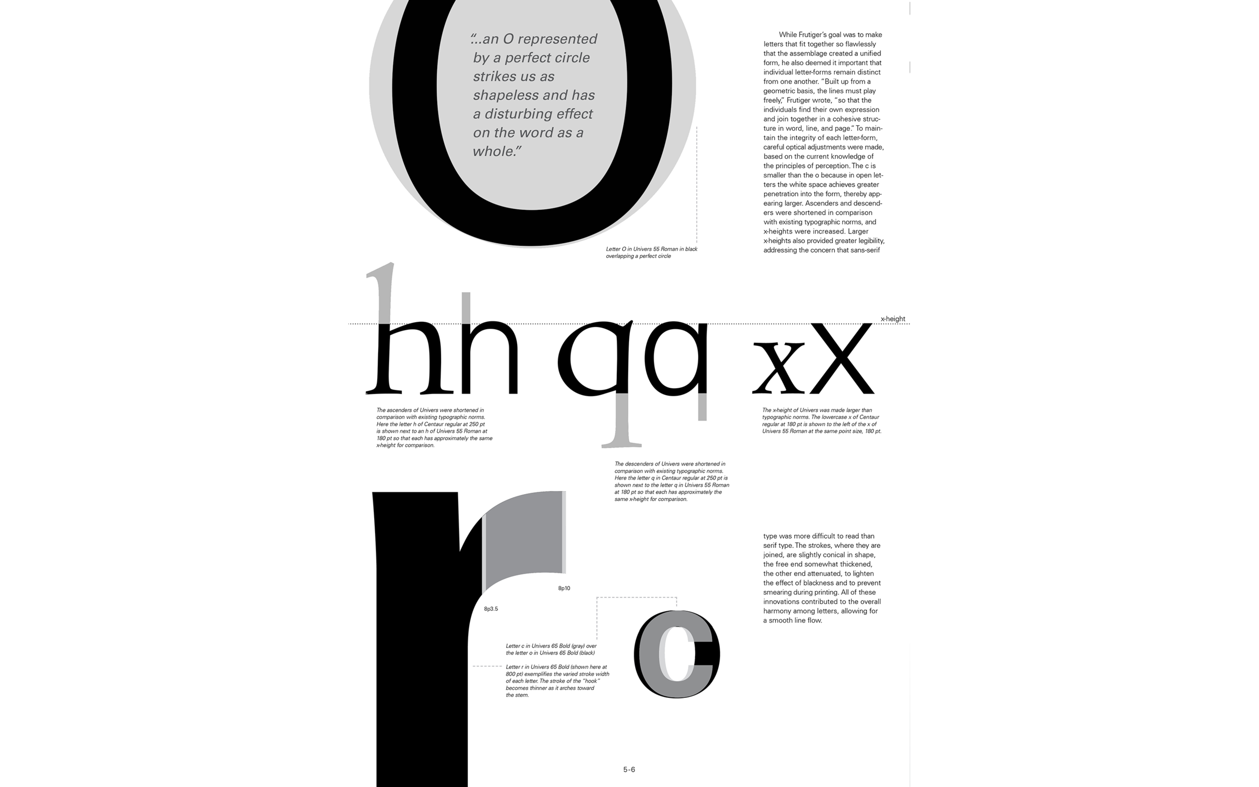
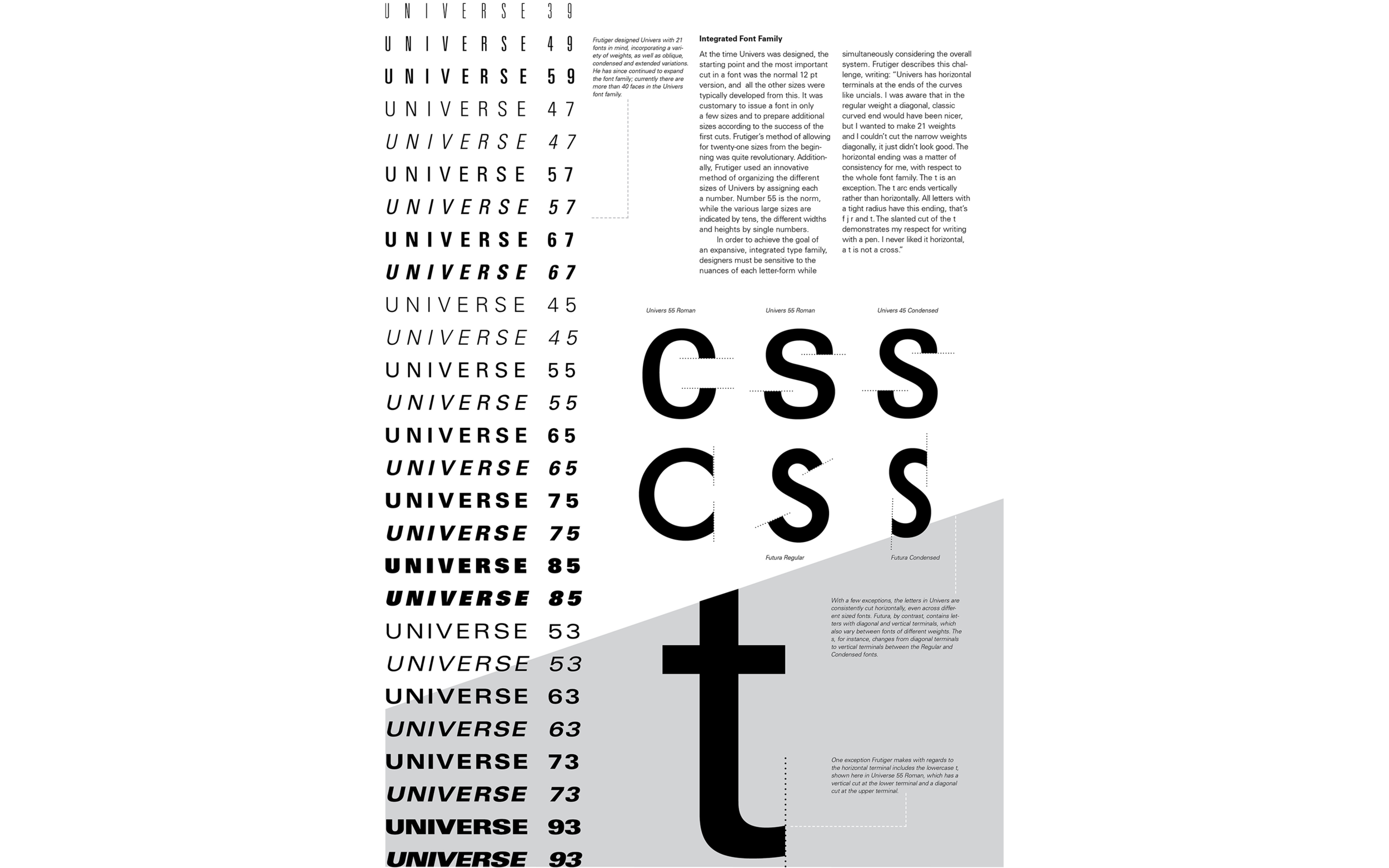
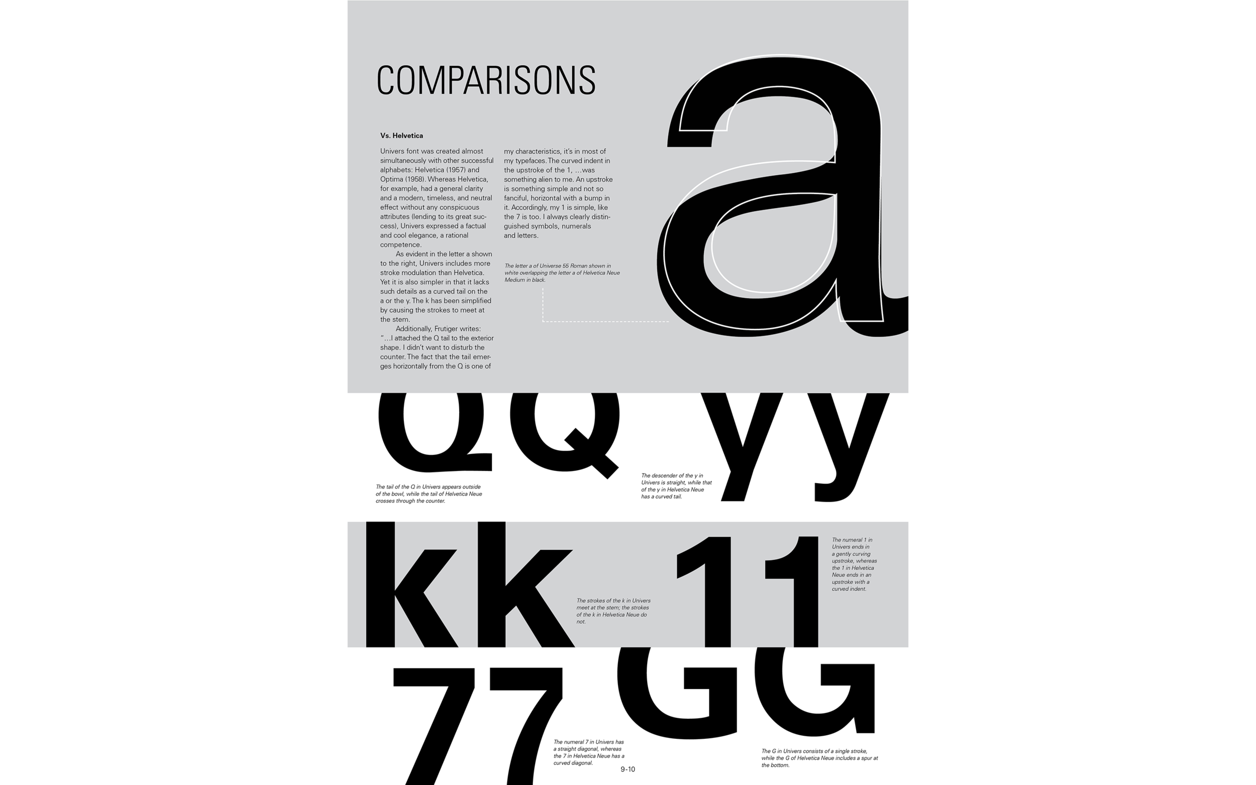
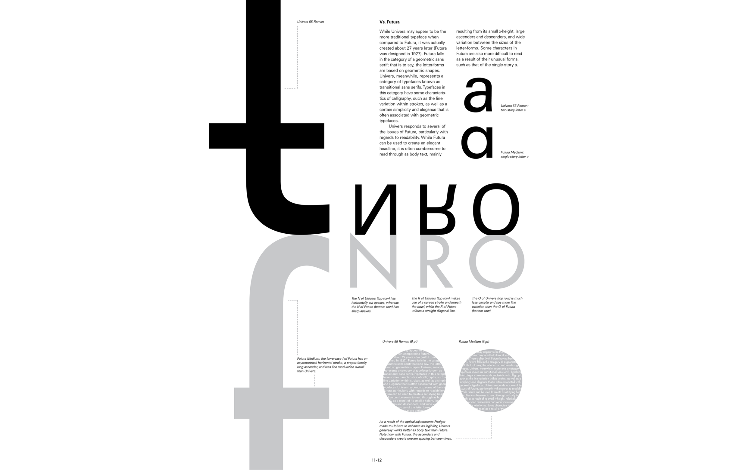
This book tells the story of the typeface Univers and its creator, Adrian Frutiger. In particular, this book uses description and diagrams to illustrate the characteristics that set Univers apart from other fonts, particularly similar sans serif fonts such as Helvetica and Futura. Each aspect of the book, from the format to the layout to the diagrams used, was designed carefully to create a cohesive and dynamic work.
Process
Before putting starting work on the design of the Univers book, I researched the font family and considered the characteristics that I wanted to highlight. Part of this involved examining the characters and comparing them to the characters of similar fonts. I also examined the various fonts within the Univers font family.
In my early sketches, I experimented with a variety of formats and themes. Here I considered a horizontal format with the use of scale as a visual motif. Additionally, I liked the idea of using poetry to illustrate the way the font looked when used to form lines of text. In the third sheet, I tried a square format.
This format included large, vertical pages. The large scale of the pages seemed to compliment the use of scale in the imagery, and as a result, I strongly considered this particular format.
This sketched showed my early conception of the horizontal fold. At this point I considered playing with positive and negative space as a kind of visual motif. As I refined this idea, I got rid of the large blocks of gray and focused on arranging the text and diagrams to create pleasing compositions.
Once I decided on format and overall feel of the book, I began to sketch out what each page of the book would look like in order.
In the early digital iterations of the book, I continued to experiment with blocks of gray to create border for the diagrams. Some ideas from this version, such as the diagrams on the fifth and sixth spreads, worked fairly well but needed refinement. Other ideas seemed unsuccessful altogether.
As I approached the final version, I changed the order of the pages to make more logical sense–starting with an introduction to typography before moving on to an autobiography of the type designer. I was also particularly happy with the new visual solutions I came up with for the fifth and seventh spreads.